
Unlike many of its contemporaries, Girls always starts with a bang, forgoing the drawn-out, cinematic title sequences favoured by True Blood, True Detective, and plenty of other shows that don’t have the word “True” in the title. It uses the title card as a sting to articulate a punchline—usually the crescendo to a discussion riddled with angst and ennui. Its strength lies in its immediacy, and seamless integration into the flow of the episode, all of which is the responsibility of Howard Nourmand, of Los Angeles studio Grand Jeté.
It Girls — they’re just like us, right? In the case of DJ/muse/model Harley Viera Newton, it seems like she’s as domestic as they come. Starring in Whetherly’s new spring ’13 video lookbook, “Faites Le Calcul,” (quick translation: Do the math) HVN appears to be suffering from multiple-personality disorder — in the most stylish way possible, of course. There’s gardener Harley, expertly trimming hedges, housewife Harley, downing gimlets like it’s her j-o-b, and housekeeper Harley, vacuously vacuuming (retro vacuums, mind you) rugs, wiping windows, and scrubbing floors (Cinderella, is that you?) — all while rocking Whetherly’s chic stripey separates, leather leggings, and casual denim cut-offs.
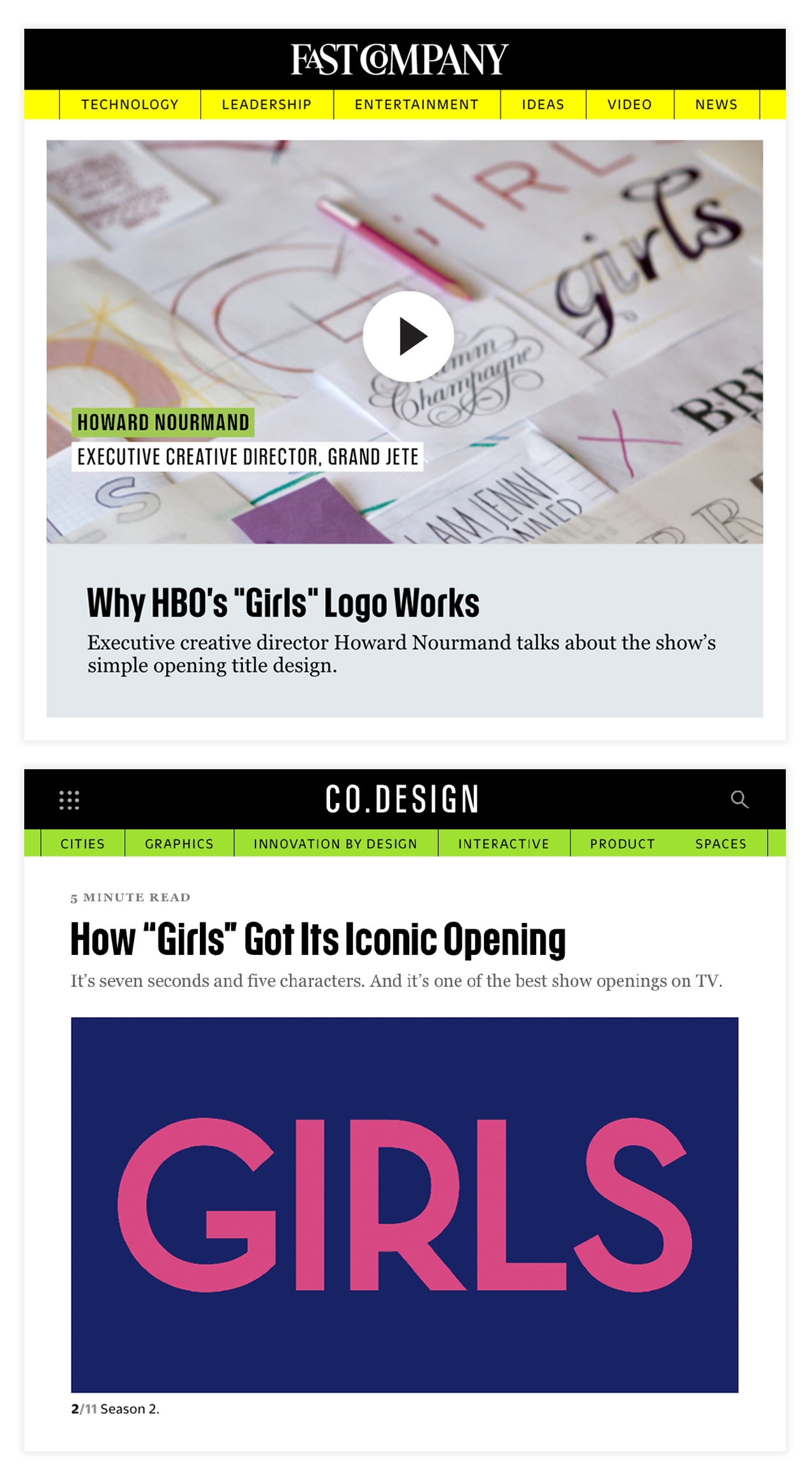
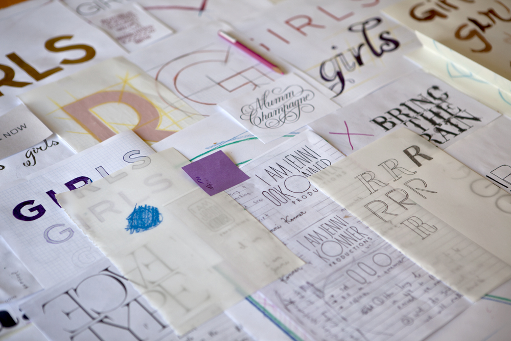
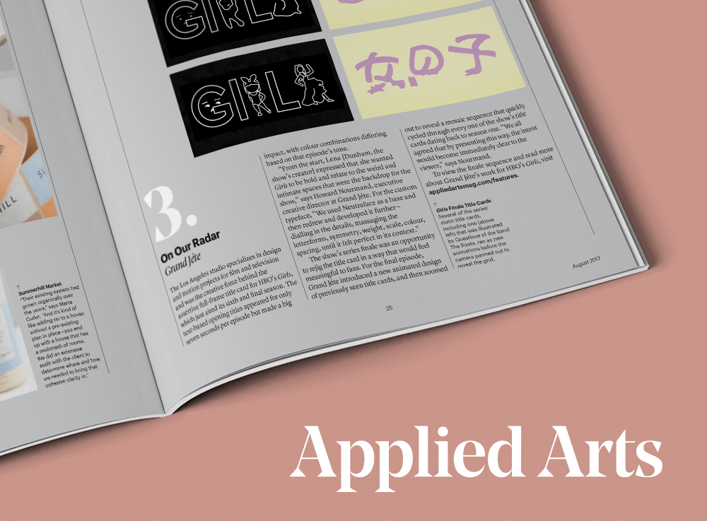
“We started asking ourselves how can we create something memorable with the restriction knowing it’s only going to be on for seven seconds and a solid card. Then the answer we had was, ‘What if it’s a different color, texture, the background changed, and the music changed?’” says Nourmand. “How could we make it feel like something that hadn’t happened before in television with those very specific variables in mind. I don’t know another show offhand that changed their title card every episode. That made it very unique and special, and gave the audience another thing to look forward to in that surprise moment.”
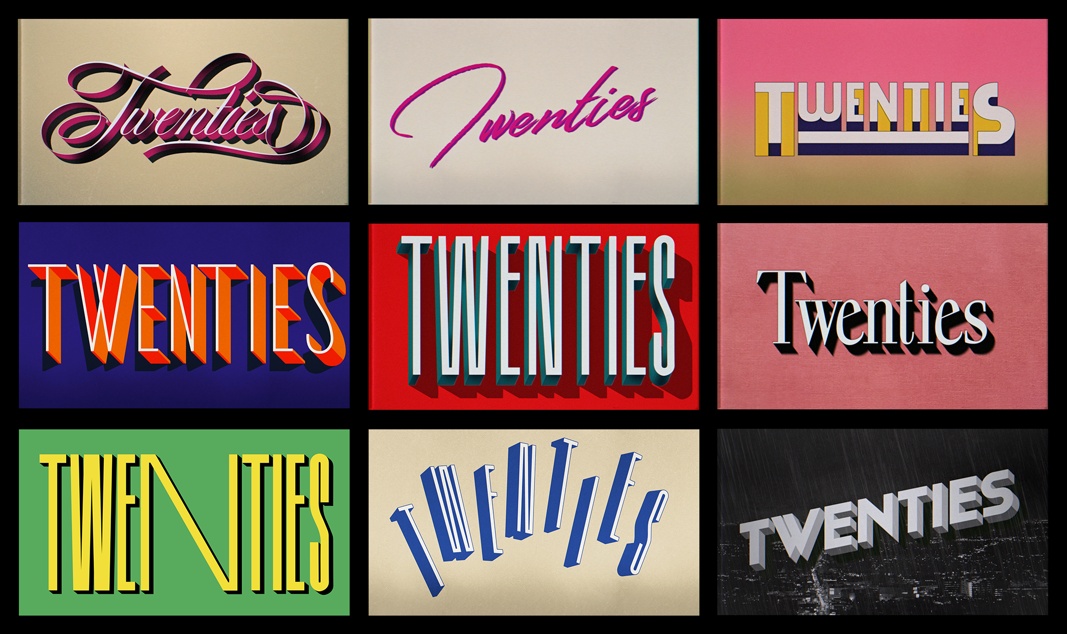
Awards Daily spoke to Howard Nourmand about his process of creating the main title for Twenties, how he got his start in Hollywood, and the giant leap he took that led him to his current career as a designer.
Instead of recycling the same New Wave hits dredged up by so many other ’80s-set shows, a soundtrack of disco, “Footloose,” and British glam-pop bands like T. Rex and Sweet feels true to the club’s clientele. The kaleidoscopic title sequence is a work of art unto itself.
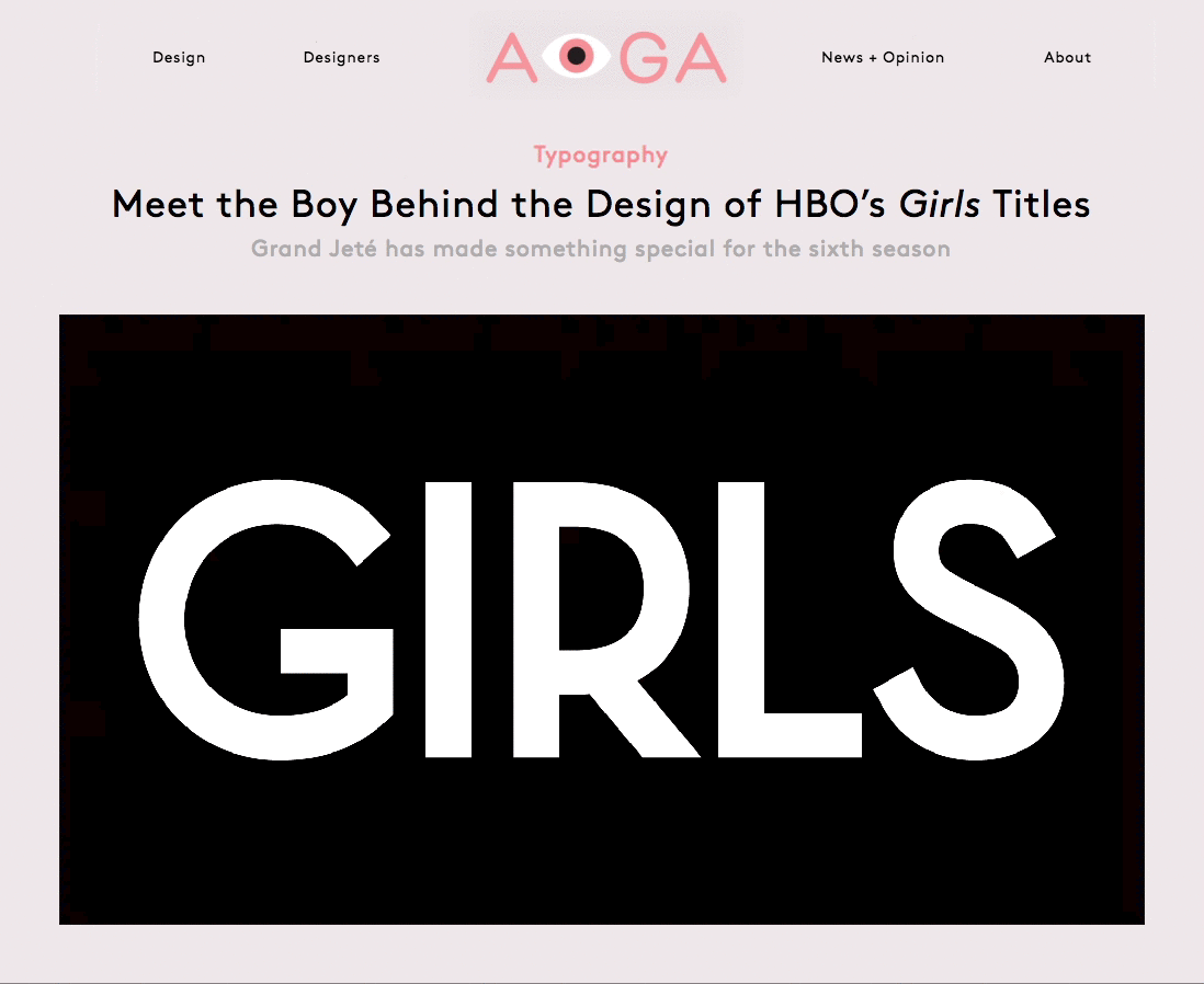
Viewers of HBO’s new series Girls can be forgiven for not paying much attention to its title sequence. Buzz about the show, which follows the complicated, passionate, and often narcissistic doings of four young women in New York City, quickly grew into a divisive debate over its feminist intentions. And that was just the pilot. With the first season now complete, it’s finally safe to shift our gaze to the striking art deco typography that opens every episode.
"We auditioned several title companies and decided on Grand Jeté because they brought a sense of humor to the work. I then proceeded to make them crazy, going back and forth with version after version, until we found our way to what’s there now."
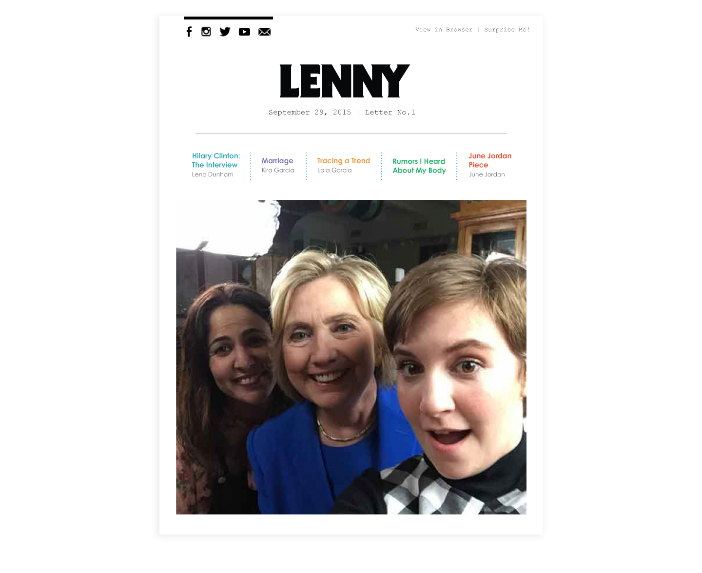
Lenny Letter is doing something exceptional — but also exceptionally old-fashioned. The feminist arts newsletter, created by “Girls” star Lena Dunham and her writing partner Jenni Konner, isn’t just sharing links and photos and gifs, as a million popular personal newsletters have before. Instead, it has in-depth interviews with the likes of Chenai Okammor, a dear friend of Sandra Bland; original fiction by writer Jenny Zhang and Dunham herself; and even an activist call to action: “Why You Should #AskYourMother About Life Before Roe.”
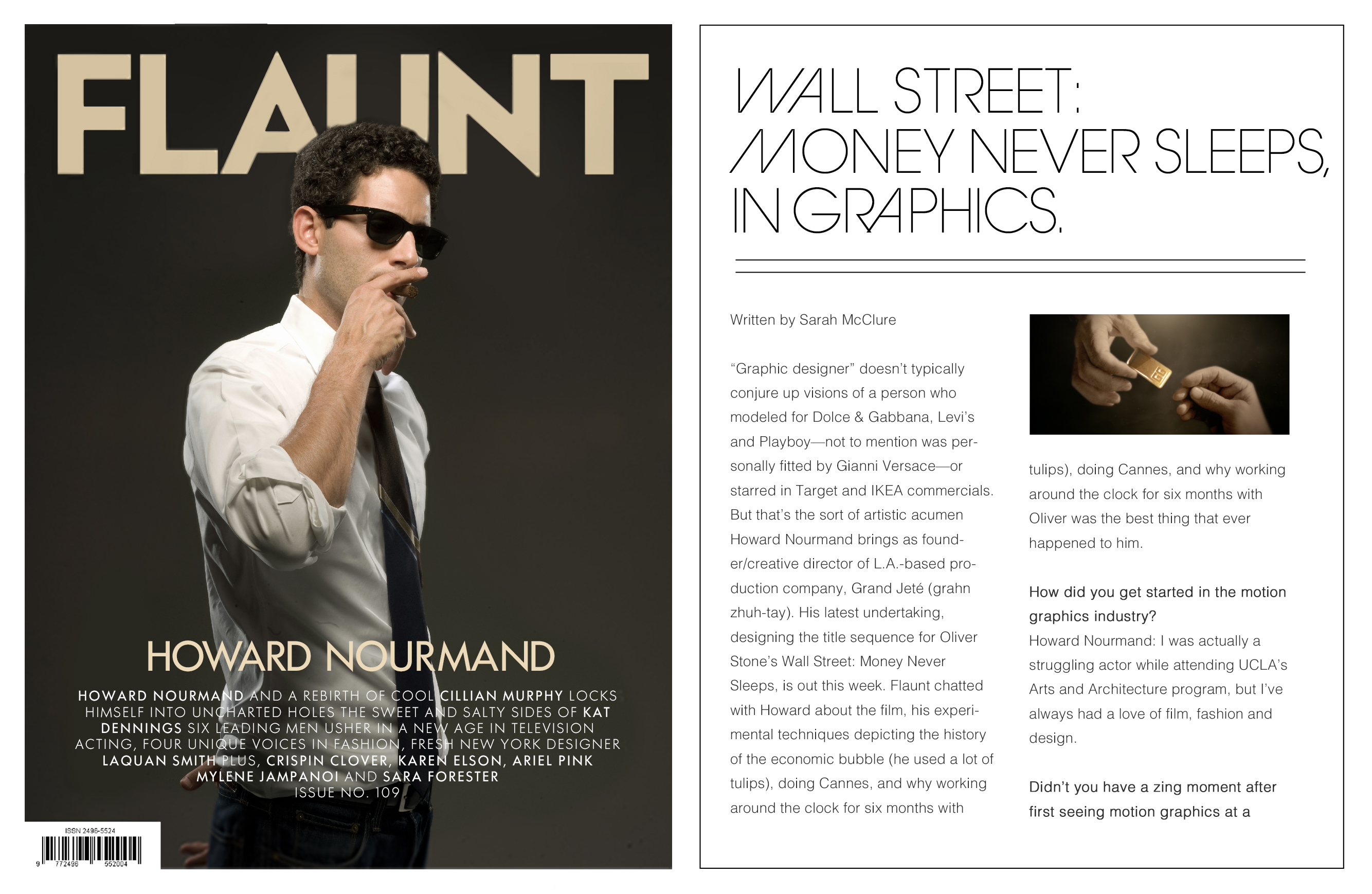
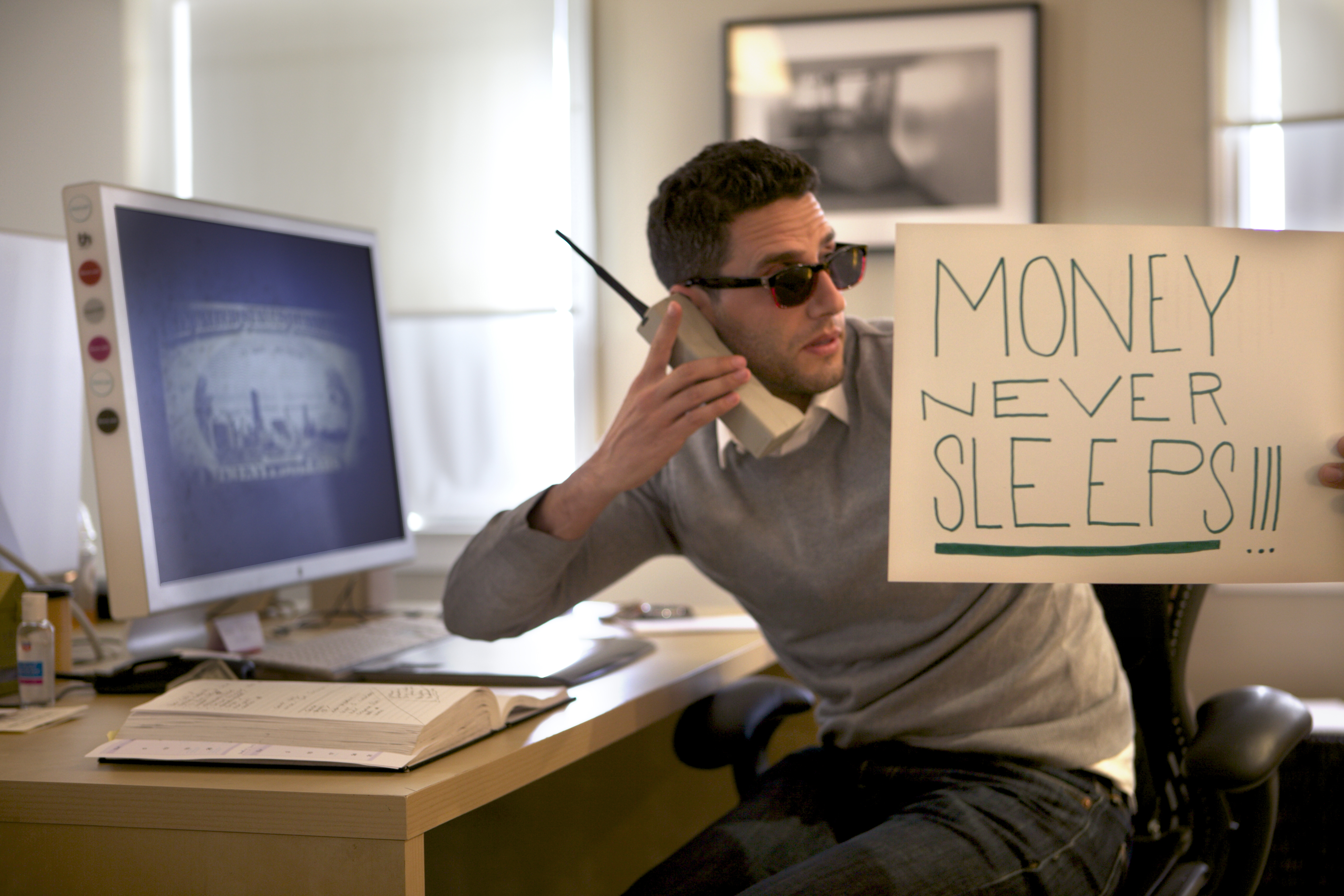
“Graphic designer” doesn’t typically conjure up visions of a person who modeled for Dolce & Gabbana, Levi’s and Playboy— not to mention was personally fitted by Gianni Versace—or starred in Target and IKEA commercials. But that’s the sort of artistic acumen Howard Nourmand brings as founder/creative director of L.A.-based production company, Grand Jeté (grahn zhuh-tay). His latest undertaking, designing the title sequence for Oliver Stone’s Wall Street: Money Never Sleeps, is out this week. Flaunt chatted with Howard about the film, his experimental techniques depicting the history of the economic bubble (he used a lot of tulips), doing Cannes, and why working around the clock for six months with Oliver was the best thing that ever happened to him.
Creative Studio Grand Jeté explored money iconography at the micro level in a painterly and hauntingly beautiful closing title sequence for director Oliver Stone’s “Wall Street: Money Never Sleeps,” the sequel to the 1987 classic “Wall Street.”
The Los Angeles studio Grand Jeté specializes in design and motion projects for film and television and was the creative force behind the assertive full-frame title card for HBO’s Girls, which just aired its sixth and final season. The text-based opening titles appeared for only seven seconds per episode but made a big impact, with colour combinations differing based on that episode’s tone.
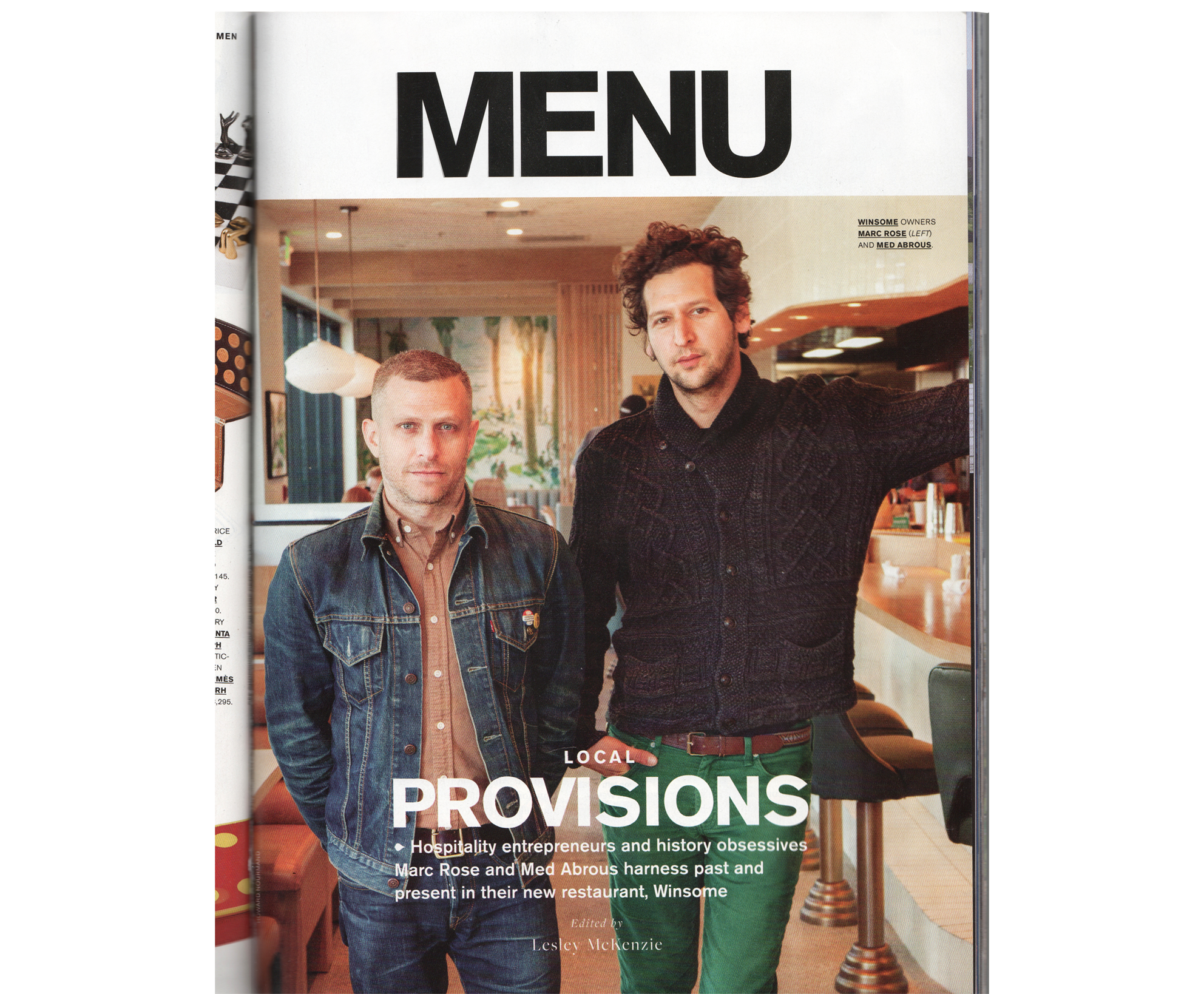
“I don’t know if we keep getting lucky, or if we’re just suckers for history,” Marc Rose jokes over breakfast at Winsome, the restaurant he opened in February with business partner Med Abrous. Located on the ground floor of the Elysian, a residential tower and building complex that influential L.A. architect Willian Pereira designed for the Metropolitan Water District in the 1960s, Winsome is an all-day, eat-drink-hang utility player on Echo Park’s eastern edge.
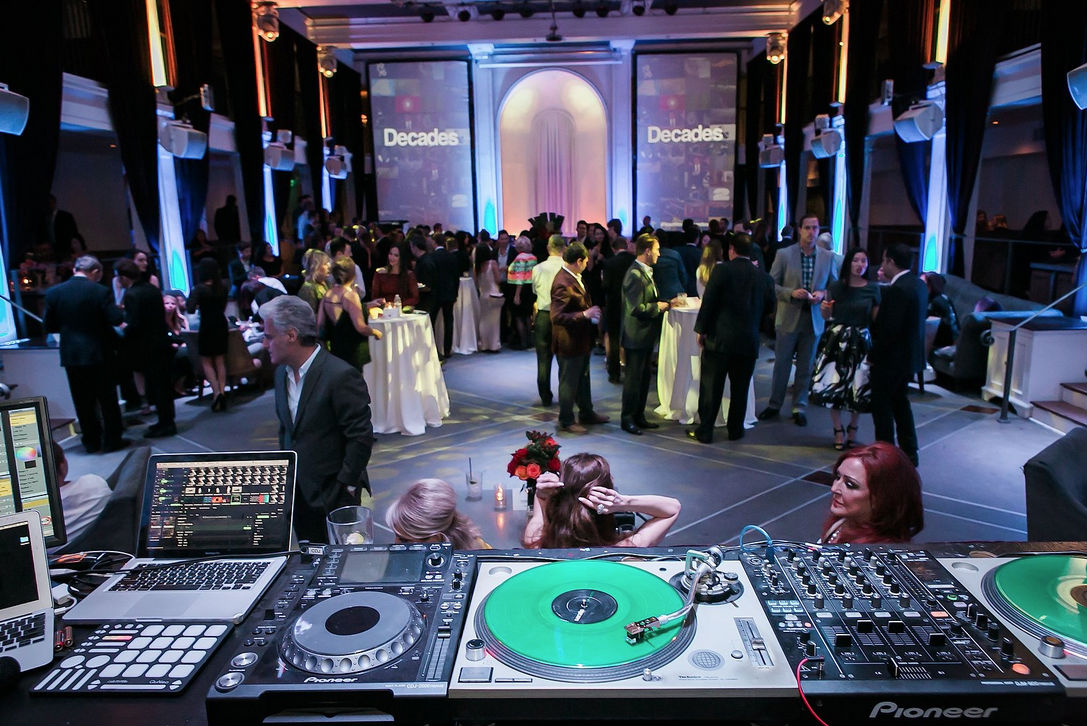
At its 40th anniversary celebration event––which took place at Boulevard3 at the historic Hollywood Athletic Club on the evening of September 15––Nourmand & Associates broadcasted its latest campaign video, “Decades”––produced by Howard Nourmand and his design firm Grand-Jete––which showcases the history of L.A. and its ever-changing cultural landscape.
The duo agreed from the start to strip it all down to its purest form. The subjects’ hair was not blown out. There was no makeup. Only available natural light was used, and there were no rehearsals. “We committed to embracing the moment, trusting that it would be enough.” It was more about representing the spirit and culture that Genetic is a part of. “We told each subject that this piece, if we were successful, would be a window into a moment of your life — like a journal entry that captures your inner voice.”
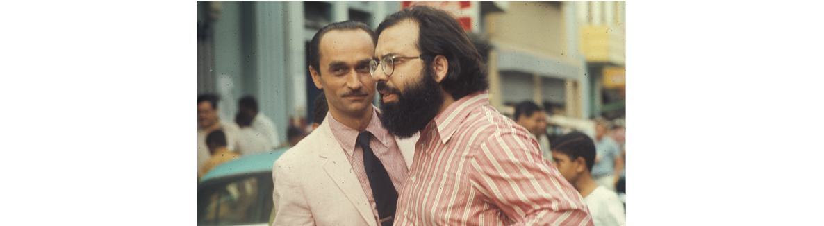
Film fans won’t encounter many better-spent 40 minutes than this tribute to actor John Cazale, “The Godfather” co-star who appeared in a mere five films — all of them, astonishingly, nominated for best picture — before dying at the age of 42, prior to the 1978 release of his final movie, “The Deer Hunter.” Both touching and an informative look at the actor’s craft, director Richard Shepard’s documentary talks to a who’s-who of Cazale’s contemporaries as well as younger actors who revere him. Before it’s done, he’ll break your heart all over again.
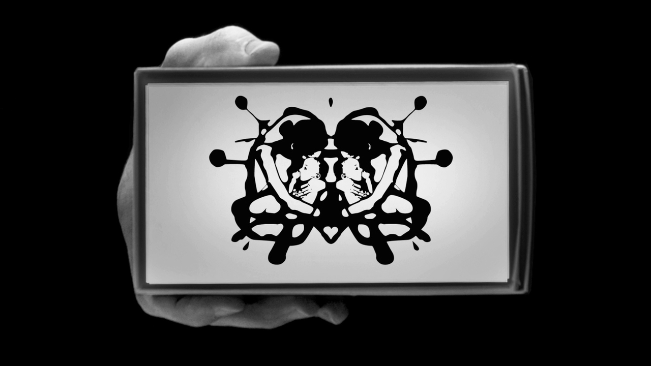
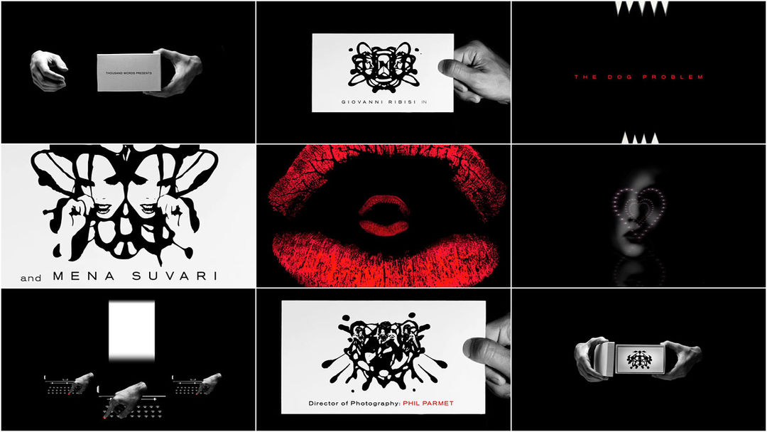
What do Rorschach ink blots, a troubled youth, and the title sequence for the film “The Dog Problem” all have in common? Well they all make up key points in the life of designer Howard Nourmand.
The Dog Problem benefits from choice music selection, good cinematography, editing, and a kick-ass opening credit sequence by Howard Nourmand that produces the characters of the film emanating out of Rorschach inkblots.
To create an intimate, journal-bound aesthetic, Dunham and Konner brought on graphic designer Howard Nourmand, who was responsible for the logos of both Girls and Dunham and Konner’s production company, A Casual Romance. "I like to think Lenny looks like something that 20 years ago could’ve existed as a pamphlet passed out on a corner of Bowery and Houston," says Dunham.
Easily the best part of that initial half-hour is the title sequence animated in Monty Python-esque fashion by Grand Jete and accompanied by an unnervingly catchy theme song by Lorre and Keb’ Mo’.
For at least its first half, Oliver Stone’s “Wall Street: Money Never Sleeps” — the sequel to his 1987 original — may be the cinema’s best dramatization of the 2008 financial meltdown. With its rapidly cut split-screens and downward spiraling electronic numbers reflecting on the panicked face of its protagonist Jake Moore (Shia LaBeouf), the film captures the fast, frenzied terror of computer-driven economic freefall like nothing else on recent screens.
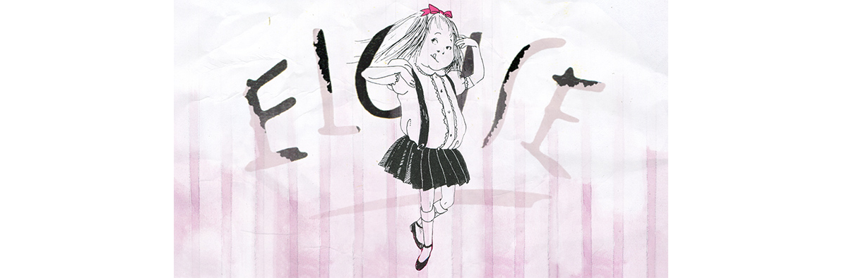
Nourmand’s company produces graphic design and animations. Grand Jeté recently worked with the HBO documentary, “It’s Me, Hilary: The Man Who Drew Eloise,” debuting March 23. The documentary, which was directed by Matt Wolf and produced by Stacey Reiss with Lena Dunham and Jennifer Konner as executive producers, focuses on artist Hilary Knight who illustrated Kay Thompson’s “Eloise” books. “Wolf was very clear that he did not want the character to turn into a cartoon,” Nourmand said. “We did animate her, but we didn’t put her in motion as much as we animated what the artist’s process would have looked like in real time; there’s a syntax to it.”
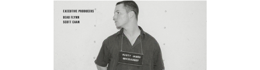
The 26-year-old actor Scott Caan likely grew up watching films his father James made during the late-1960s/early-1970s, and the influence shows in his debut as writer-director, “Dallas 362.” Set and shot, like last year’s “Spun” and “The Salton Sea,” in grimy flophouses and back alleys of Los Angeles, Caan’s picture refreshingly refrains from borrowing from those films’ stylistic handbook. Rather, it has a relaxed poeticism to it; it’s a sweetly naive, adolescent Hemingway fantasy with a star-making performance by Shawn Hatosy and good ones from everyone else (including Caan). The recipient of the critics’ jury prize at Cinevegas, this low-key but accomplished pic definitely has a future as a festival item and a specialized theatrical release.
Some of the most striking and stylish opening titles you ’ll see all year confirm the positive impression, and from here on in, the audience is happy to give Caan the director the benefit of the doubt – even if Caan the writer seems less of the finished article.
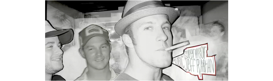
Howard Nourmand’s design for the opening title sequence to Scott Caan’s “The Dog Problem” features the inkblot intricacies of love. The tunneling lips and abstractions are propelled by the music of Mark Mothersbaugh (Devo).
Having written and directed a few theatrical productions, there’s a bit of staginess to some of the scenes which is easily overcome by the performances and the written word. But flashes like the dazzling opening credit sequence and the staging of a heist to the tune of Giorgio Moroder’s Midnight Express score show off both a patience and a flair that hotshot newcomers can tear a page out of.
The title sequence for Girls is simple but distinct: a single frame of bold typography. Though Lena Dunham's HBO series nearly kicked off with an intro reminiscent of Requiem for a Dream's iconic scene of people getting high. An earlier idea, creative director Howard Nourmand tells The Creator Project, was to build a montage of mundane daily routines in the form of macro shots of a clogged drain, toast, coffee, and teeth flossing. “Up close and personal,” he reads from the pitch description. “This short and sweet portrait captures the daily routine of various girls in the show.”
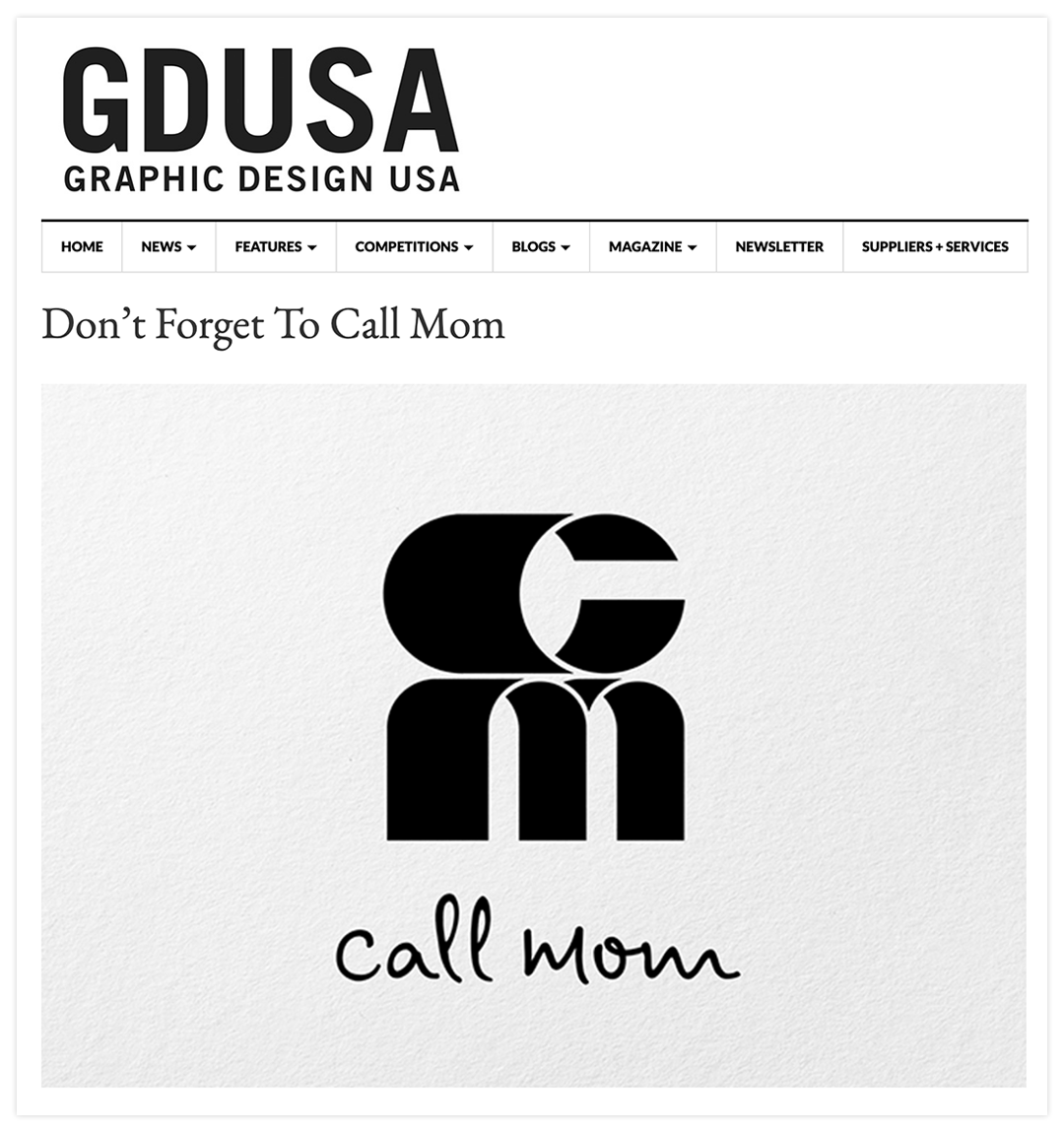
Marc Rose and Med Abrous are the team behind several popular Los Angeles CA restaurants such as Winsome, The Spare Room, and Genghis Cohen. They recently launched an umbrella brand for all their properties: Call Mom. The logo for this new entity was designed by Grand Jeté, a creative studio specializing in design and motion graphics, who aimed to graphically represent the collaboration between Rose and Abrous. Grand Jeté produced a short video explaining the evolution of the Call Mom logotype, from brainstorming to finalization. There are visual insights into the process, including sketches, drafts, and animations of the two figures that combine to create the letterforms of the logo.
REVIEW: From the pitch-perfect period opening credits sequence to the liberal sprinkle of classic cuts, Fight Night: The Million Dollar Heisis an evocative, provocative drama that demands your attention.
The opening credits go full B-movie, complete with weathered film stock and the vintage NBC peacock logo.
“Fight Night” enjoys leaning into genre, with ’70s visuals in the title sequence and multi-frame editing, an irresistible soundtrack, sequences plucked from a crime procedural or heist movie, and the kind of exaggerated characters that modern TV is always trying to water down and restrain with realism. It’s lavish and sexy and slick in exactly the way these figures would have been.